
 Classic
5 ways you can use colour to influence the mood of a room
Swigging energy drinks to get through the day. Reading motivational books to lift your spirits. Counting sheep to fall asleep. Breathing deep to release stress. We bet you’ve tried all this and more to manage your mood. Did you know that there’s an easy fix right there in your home?
Broadly speaking, colours are categorised as warm or cool. Warm colours include red and yellow, and colours close to it in the spectrum. Cool colours include hues of blue and green. Warm colours energise, while cool colours soothe.
Here’s a look at 5 colours and how they can affect your mood.
1) Looking to ramp up the energy? Think red.
special effects finish can
create an aura of energy.
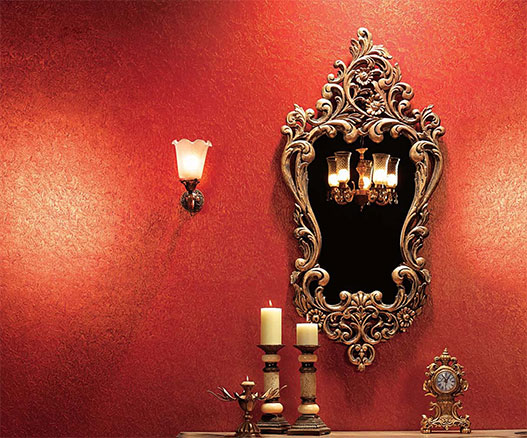
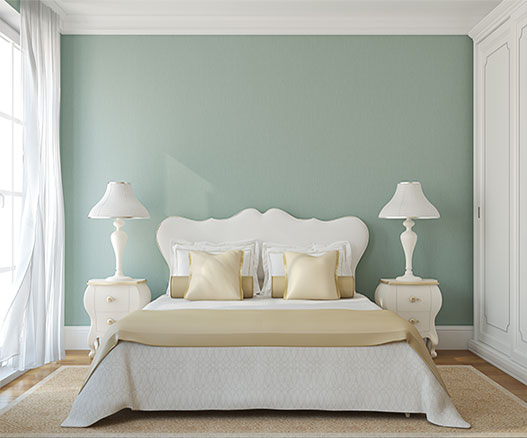
Although conventional wisdom says red is not restful enough for the bedroom, we believe it can be used to create a happy and passionate ambience if it is used carefully and in combination with a more restful colour or a neutral shade.
Red can also be incorporated in offices, especially in meeting rooms and other high energy areas.
Associated with: Love, passion, energy and excitement
Colour tip: Restrict red to one wall, trims or a few objects such as a rug, cushions, or bedside lamps.
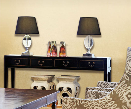
2) Want to create a happy vibe? Sunshine yellow does the trick.
Warm colours like yellows and oranges are mood enhancers. They mimic sunshine and light, and instantly lift your spirits. They’re especially great for brightening dark corners and maximising the natural light that is already available in the room. However, like all bright shades, it must be used in moderation with deep yellows, and restricted to one or two walls.
You could even paint your wall in different shades of yellow - from a pale maize shade, to maybe even a bright lemon. Try stripes of alternating yellows. Mustard yellow can be used to create an earthy yet vibrant feeling. Yellows, oranges and peaches also work well in dining spaces, as they are food related colours, and enhance the appetite.
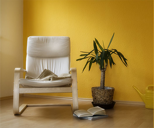
into the home.
Colour tip: For a more subtle incorporation of yellow or orange, try its milder variants such as beige or peach.
3) Want to create an oasis of calm? Try lavender.
soothing effect,
no matter the
size of the space
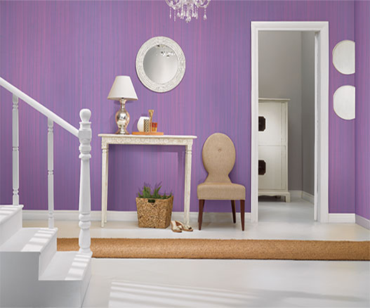
Colour tip: Lavender can be matched with pale green for an interesting contrast, or with silver for a more glamorous look.
4) Trying to fight the blues? Use this hue correctly.
of tranquility.
However, you must avoid painting all four walls of a room in a deep blue, unless it is a room with plenty of light. Reserve it for a feature wall, and brighten your room with other accessories. Dark blue is also a great choice for trims.
Associated with: Peace, tradition, authority, sincerity
Colour tip: Match blues with vivid complementary colours like orange, or contrasting shades such as red or yellow, and balance it with cream or beige to generate energy.
5) Feel like instant celebration? Go for gold.
a mood of celebration.
Colour tip: Do up a room with a gold-based feature wall with jewel tone accessories or furnishings in shades of emerald, royal blue or purple.
Which colour makes you happy or sad? Tell us below.
-
Get Inspiration
-
Make My Plan

Let us design a project plan
to suit your needs.
-
Colour Spectra
Choose from over 1800 original hues.